BRAND GUIDE
Navigation
Use Guide
The brief is to refine and expand the Kai Connect identity to reflect evolving priorities, a specific approach, and a growing reputation in the financial services and impact investment community.
Together we shaped a visual and verbal system that feels fresh, decidedly South African, and restrained.
The visual language is restrained and bold. Inky black, fearless red, and nearly pure white anchor the story, while a limited set of geometric shapes express energy and maturity.
We draw inspiration from the Bauhaus ethos, modernism, and African surface pattern design. Animation conveys a sense of forward movement and dynamism central to the identity. Kai Connect is cool and bold, while retaining a deep respect for history and place.
This guide is a practical manual for the Kai team and service providers. Use the navigation menu to explore the visual identity and follow links to download assets.
The Pitch
THROUGH INNOVATIVE CAPITAL STRATEGIES AND ACTIVE PARTNERSHIPS, KAI BUILDS RESILIENT BUSINESSES THAT CREATE LASTING PROSPERITY FOR PEOPLE, COMMUNITIES, AND FUTURE GENERATIONS.
Values
- AFRO-CONFIDENT
- SINCERE
- MEASURED
- BRAVE
- VISIONARY
Logo Lockup
The Kai Connect identity has growing recognition, so we kept the logo and made adjustment for usability and longevity. We sharpened the letterforms and lightened “Connect” so KAI stands out clearly as the lead.
The system limits colourways and sets clear space, minimum sizes, and placement rules for consistent use. Logo reveal animations are included to support digital and video content.
We also created descriptor lockups for Kai-led initiatives and partnership lockups for programmes managed or supported by Kai.
Typography
Bold headlines to set the pace and universal body for story and detail. Headings use Outfit and body uses Source Sans 3. Both are Google Fonts to reliable access and versatility across platforms.
Maximum two weights per page/screen, sentence case in Outfit for main headings, and spacing/line-height on an 8-pt rhythm.
Colour Palette
The palette is considered and bold. Smokey black and rich white do most of the work. Blue and red act as accents for emphasis, data points, and highlights. Do not use red for body text. Where possible, limit each page or screen to two colours.
Custom Icons
We designed functional and versatile icons for the brand refresh. Each uses simple geometry and clean cut-outs to stay clear at any size. The set covers contact details, value-proposition symbols, and bullets.
CONTACT INFO
ADDRESS
phone number
WEBSITE
Value Proposition
impact driver
Capital Innovator
Ecosystem Builder
Active Partner
Key Sectors
manufacturing
Automation
Green Energy
Mining
Bullets
Bullet 1
Bullet 2
Bullet 3
Bullet 4
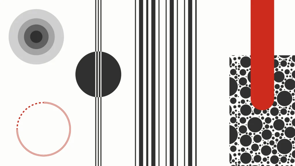
Patterns
Simple and pared-back, the pattern set adds vibrance without noise. Built from vertical stripes and circles, it should use no more than two colours, give type generous clear space, and never sit behind small text. Use low opacity for large fills, and reserve bolder treatments for social and video transitions or highlights.
Infographics
Minimalist and easy to understand at a glance. Place every element on the grid and lead with large numbers and clear data points. Set all data with tabular lining figures. Use motion to reveal and clarify. See the infographic on Kai’s impact and capital model for the format to follow.
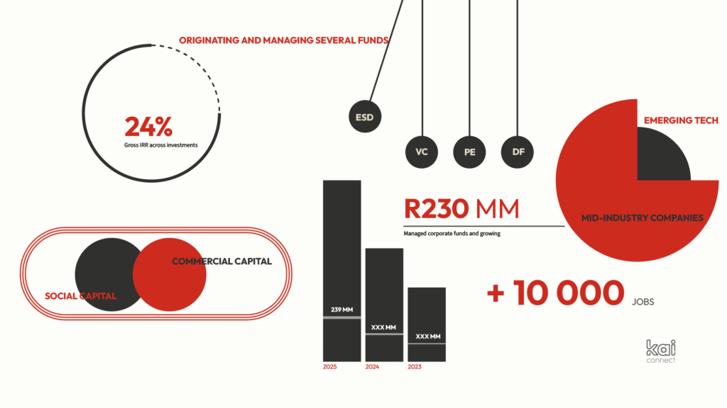
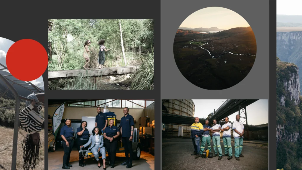
Image Treatment
Kai is vibrant, considered, and transparent. Use wide-angle nature and city scenes that are unmistakably African, as well as candid images of people in motion. Images should feel natural, open, and connected to real work and places.
Where relevant, include images of the Kai team and portfolio companies.
Avoid heavy filters. Desaturate images to keep focus on the content.