KIA CONNECT
Refine and Evolve
The brief was to refine and expand the Kai Connect identity to reflect evolving priorities, a specific approach, and a growing reputation in the financial services and impact investment community.
- Brand Story & Strategy
- Visual Systems & Identity
- Mockups and Templates
Values
- AFRO-CONFIDENT
- SINCERE
- MEASURED
- BRAVE
- VISIONARY
Typography
We chose accessible and versatile type, with bold headlines and clear body text.
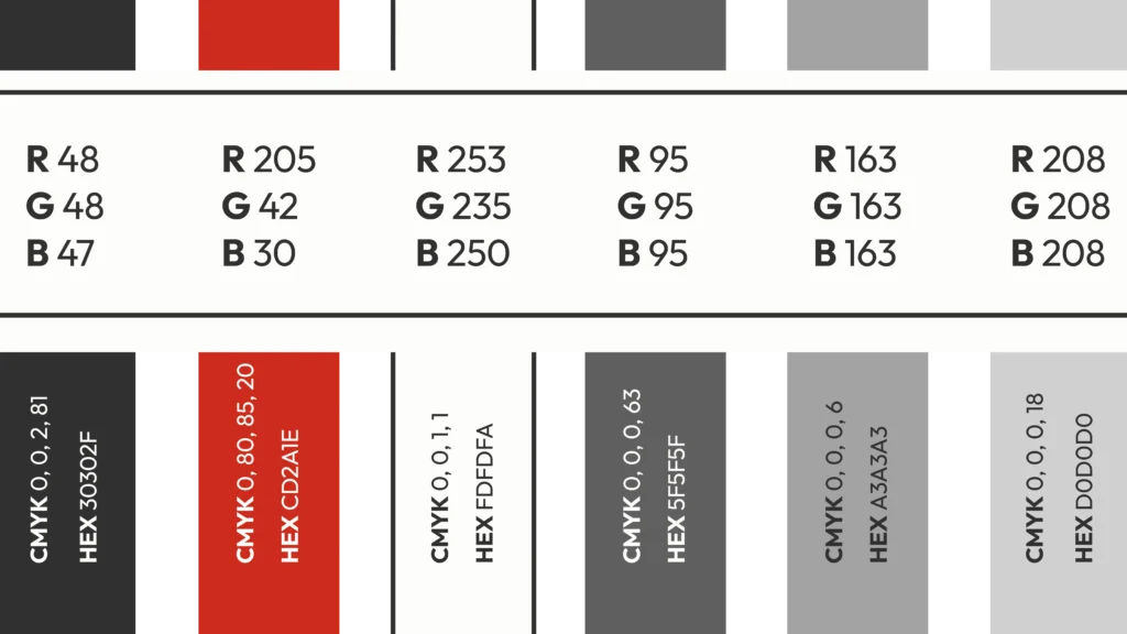
Colour Palette
The palette is considered and bold. Smokey black and rich white do most of the work.
Custom Icons
We designed functional and versatile icons for the brand refresh.
CONTACT INFO
ADDRESS
phone number
WEBSITE
Key Sectors
manufacturing
Automation
Green Energy
Automation
Mining
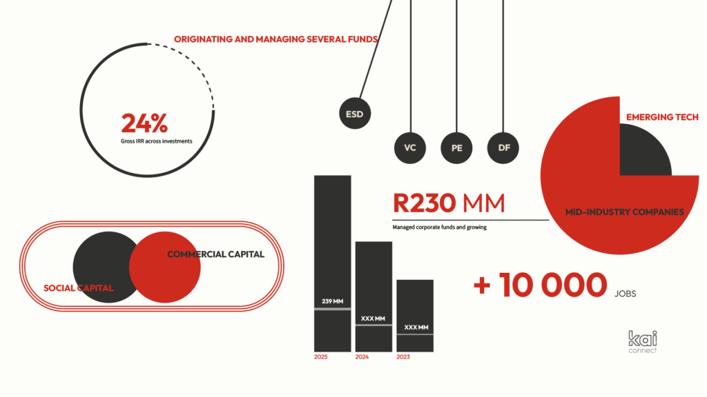
Infographics
Minimalist and easy to understand at a glance.